How to make a pie chart in Google Sheets with 5 easy steps
Showing information visually is the best way to help people understand complex data. Here’s how to make a pie chart in Google sheets and do just that.
.png)
The human brain processes images 60,000 times more quickly than it does text, and 90% of the information sent to the brain is visual.
So, it makes sense that showing information visually is the best way to help people understand spreadsheets full of complex data.
Google Sheets pie charts are a great tool for this purpose. They break down information into easy-to-read segments and make it super easy to see proportions and relationships at a glance.
In this guide, I'll explain how to make a pie chart in Google Sheets, step-by-step, with some secret tips and tricks.

How to make a pie chart in Google Sheets: 5 simple steps
Making a pie chart in Google Sheets will be a breeze with these easy steps:
Step 1: Enter or import your data in Google Sheets
First things first, you'll need to open Google Sheets. If you haven't already, head over to your web browser and go to Google Sheets. Click on the + (blank spreadsheet) option to create a new, empty spreadsheet.
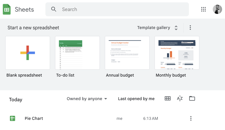
Once your new spreadsheet opens, you'll see a grid of empty cells. Now, let's get your data in there.
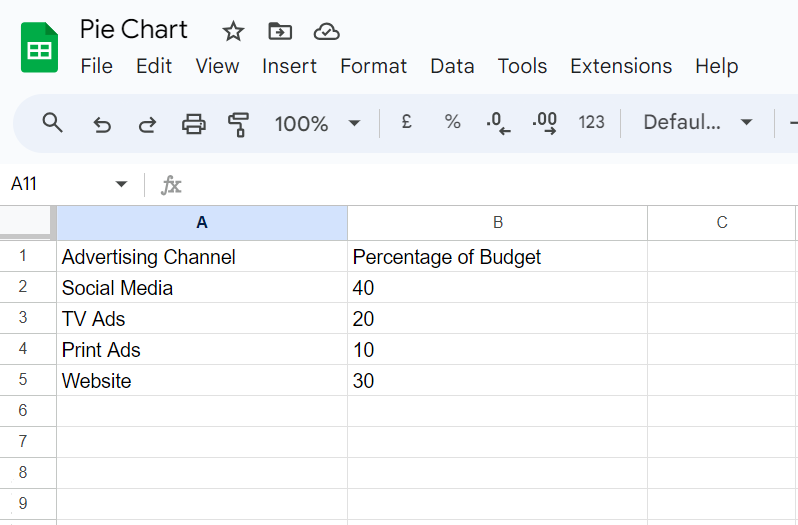
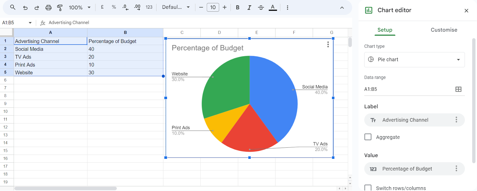
In our example, we're looking at the percentage of advertising budget allocation, so data would be the names of advertising channels (like Social Media, TV Ads) and the percentage of total budget assigned to each.
In the first row (A1, B1, C1, etc.), type clear labels for each piece of information you're including. In our case, we will write "Advertising Channel" in cell A1 and "Percentage Budget" in cell B1.
From the second row onwards (A2, B2, etc.), enter the actual data details for your pie chart. So, under "Advertising Channel" (cell A2), you might write "Social Media" and in the corresponding budget column (B2), enter a specific amount. (e.g., 40%)
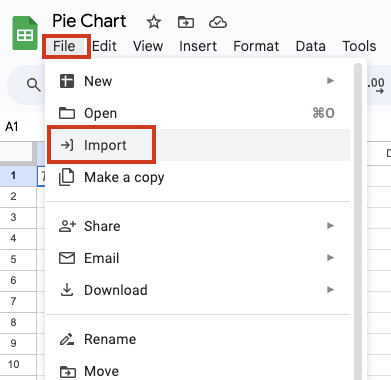
If you already have the data on your computer and want to make a pie chart using that data, you can import it into Google Sheets. To import the data, click on “File” at the top left corner of your new spreadsheet and click on “Import.”
Step 2: Select the data
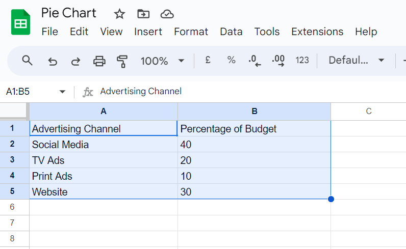
With your data all prepped in the spreadsheet, it's time to select which bits you want to use for your Google Sheets pie chart. Click on the cell in the top left corner of your pie chart table. This is usually cell A1.
Now, hold down the mouse button and drag your cursor all the way down to the bottom right corner of the data you want to include. All the cells should be highlighted in blue.
Step 3: Insert the chart
Look up at the top menu bar in Google Sheets. Click on where it says "Insert”. A dropdown menu will appear with a bunch of options. Find the one that says "Chart" and give it a click.

Google Sheets is pretty smart and will usually guess that you want a pie chart based on your data. So, you might see a pie chart appear automatically on your sheet.
Step 4: Choose your pie chart
If you don’t see a pie chart appear automatically, don’t worry. On the right side of your screen, you'll see a menu with different chart options. Look for a section titled "Chart type."

It will have a dropdown menu. If a pie chart isn't already selected, click on that dropdown and choose "Pie chart."
Step 5: Customize your pie chart
In the Chart Editor, go to the Customize tab. Play around with the different features you see under this tab to make your pie chart look just the way you want.
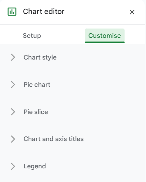
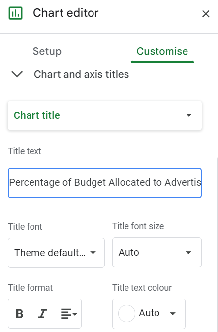
First, let's change the chart title. In the Customize tab, click on Chart & Axis Titles to expand this section.
Under Title text, type in your desired chart title, such as "Percentage of Budget Allocated to Different Advertising Channels."
This will update the title displayed at the top of your pie chart and make it clear what data is being represented. You can also change the font style, color, and size.
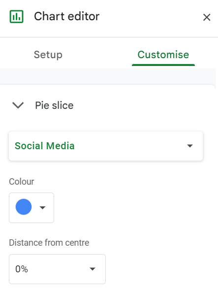
Next, you might want to adjust the slice colors to make your chart more visually appealing or match your brand color palette.
In the Customize tab, click on Pie slice to expand this section. Click on each slice to change its color. A color palette will appear from where you can select the color you prefer for each slice.
After making these adjustments, review all the changes to ensure your pie chart looks the way you want. Make any final tweaks, such as adjusting colors, fonts, or pie chart labels, to perfect your chart.
Google Sheets pie chart tips & tricks
Here are additional tips and tricks that can help you make the most out of your Google Sheets pie chart.
Convert the chart into a 3D pie chart
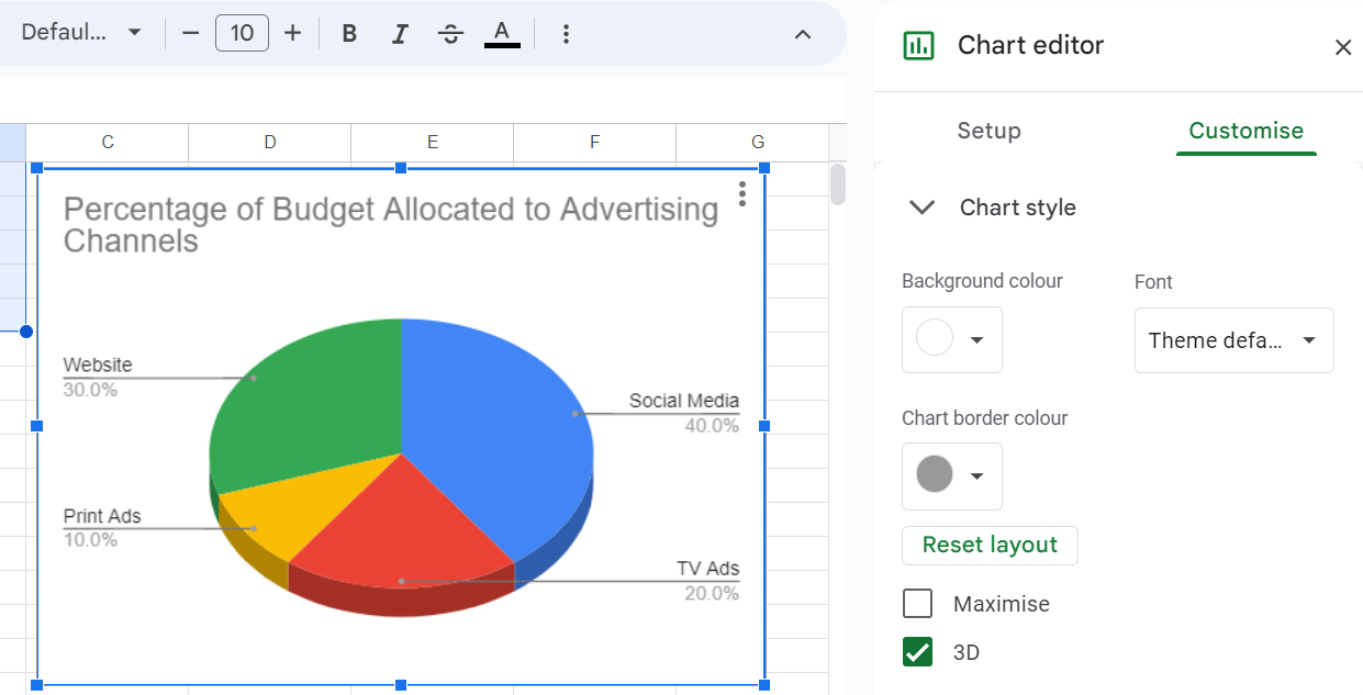
To give your Google pie chart a 3D effect, go to the customize section of your chart editor and click on “Chart Style.” Check the box next to 3D to make a 3D pie chart. It will give a three-dimensional look to your pie chart and make it visually striking.
Highlight a slice
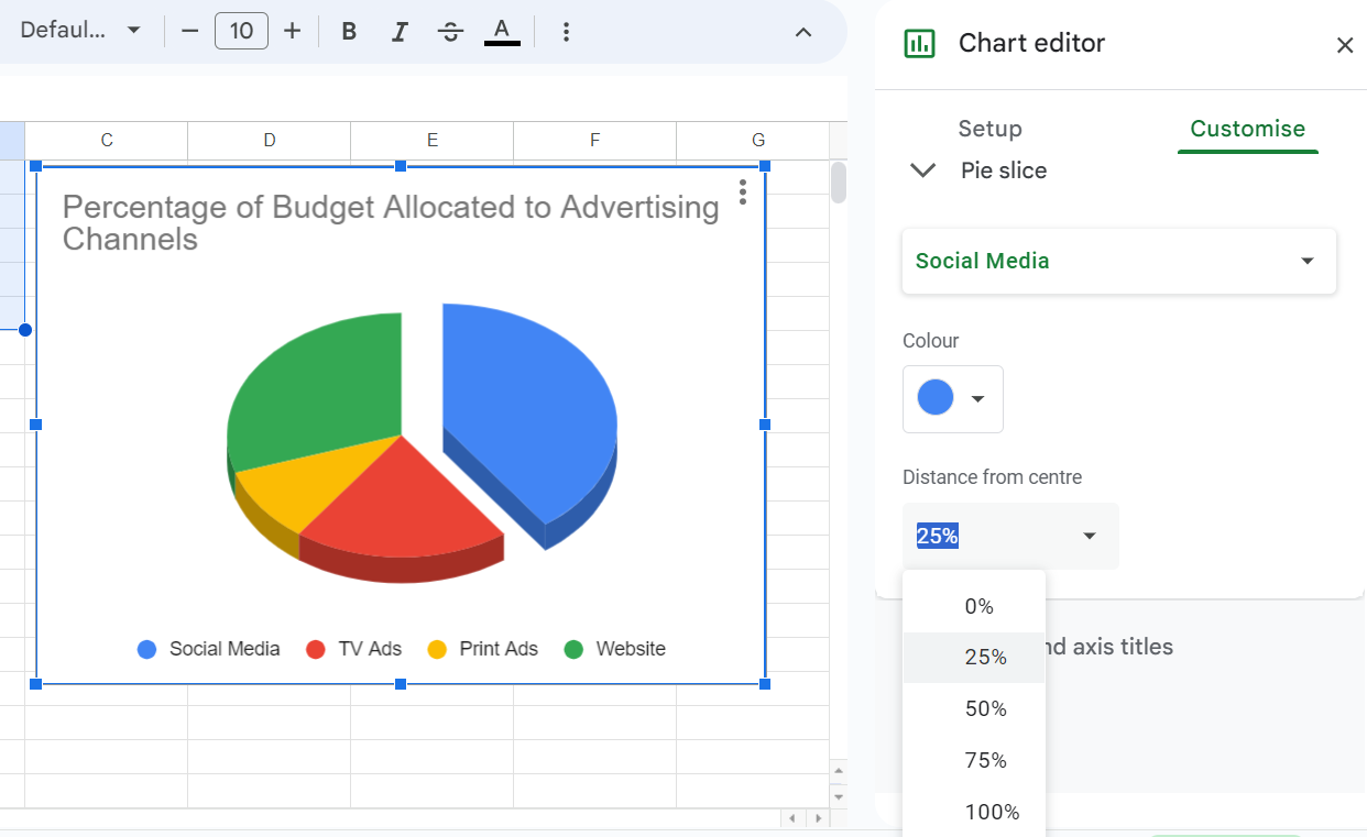
Let's say you want to draw extra attention to a specific slice of your pie chart. Google Sheets allows you to pull out a slice for emphasis.
In the customize section of your chart editor, click on “Pie Slices.” Click on the slice you want to highlight. You'll see various options appear.
Under “Slice distance from center,” adjust the slider for the slice you want to emphasize.
Use custom colors
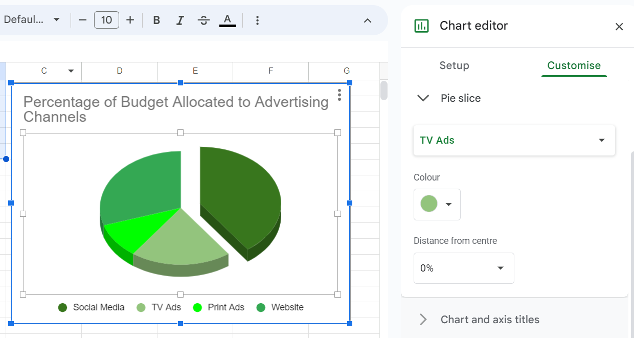
For branding purposes or personal preference, you can use specific colors in your Google Sheets pie chart.
Open the Chart Editor and go to the Customize tab. Click on “Pie slice.” You can click on each slice to change its color using a color picker or by entering a specific hex color code.
4 Popular uses of pie charts
Pie charts are extremely handy for representing complex datasets visually. But you can’t use them with all forms of data. So, which data would be suitable for a pie chart?
For a pie chart, you need categorical data where each category represents a part of the whole. Each category must have a corresponding numerical value that indicates its proportion of the total.
To accurately represent the whole, ensure that the sum of all the categories' values equals 100%.
Here are some suitable uses of when pie charts:
Display survey results
You can use pie charts to showcase the results of a survey, especially for questions with categorical responses. For instance, you can display the percentage of respondents who chose each option in a survey question.
Show proportions of a whole
Whenever you need to show how different parts make up a whole, a pie chart is a suitable choice. For example, you can display the proportion of different types of feedback (positive, neutral, negative) received by a service.
The data required is the different parts and their respective percentages of the whole.
Compare sales by product
You can use pie charts to compare sales figures by product categories to visualize which products are contributing the most to total sales. The data needed includes the product categories and their respective sales figures or percentages of total sales.
Illustrate population distribution
Pie charts can illustrate the distribution of a population by categories such as age groups, gender, or ethnicity. Such charts help in understanding the demographic makeup of a population.
You just need the different population categories and their respective percentages of the total population to make the chart.
A better tool for making pie charts!

You have now finally learned how to make a pie chart in Google sheets. But is there a better tool for making pie charts? You bet!
While Google Sheets is a handy tool for making a pie chart, Formaloo is a better alternative. It has an easier, more intuitive interface for creating pie charts and a variety of other charts and data visualizations.
With Formaloo, unlike Google Sheets, the process of making a pie chart will be automatic and in real-time. You can also find various stunning chart templates without having to code anything, including pie charts, that are guaranteed to make your data pop.
Extensive design options and customization features will also ensure a much more aesthetically pleasing representation of your data.
Check out Formaloo for free.




-min.png)


